
Welcome to my Handpicked by Milk and Honey Group newsletter. For new subscribers, in this weekly newsletter, I share my top picks for the week - trends or particularly noteworthy designs. Each week I share an interior, a real estate listing, and a style item that I think is special. I hope you'll let me know what you think!
1] Handpicked: INTERIOR
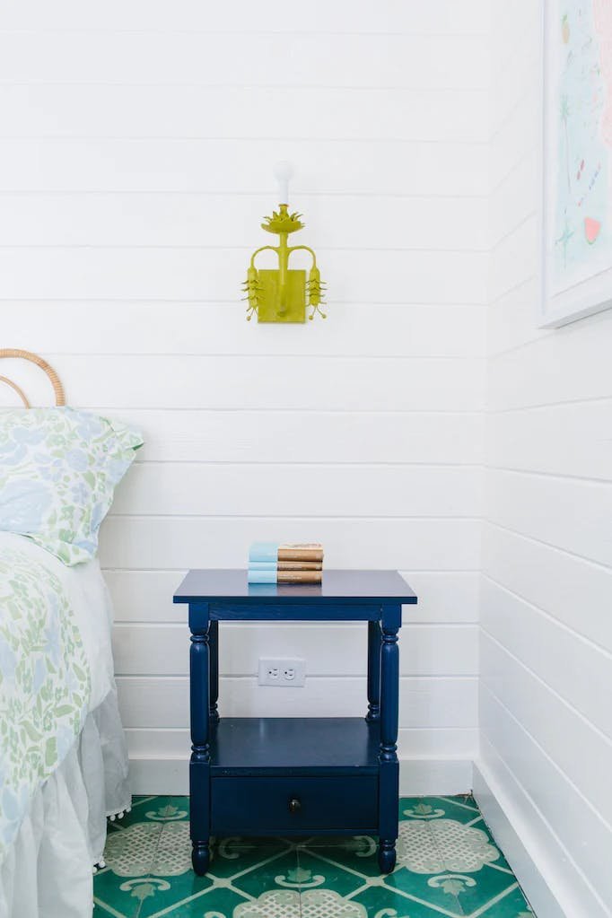
Studio Robert McKinley is probably most well-known for their hospitality spaces, like Montauk's dreamy Surf Lodge. But I love their residential spaces, especially the ones that they design and rehab to flip because they make careful, selective design choices that are cost-conscious to create design-forward spaces. Just look at their tile selections in their baths! Affordable materials, but laid in innovative patterns and color combos to create spaces that are fresh and unique.
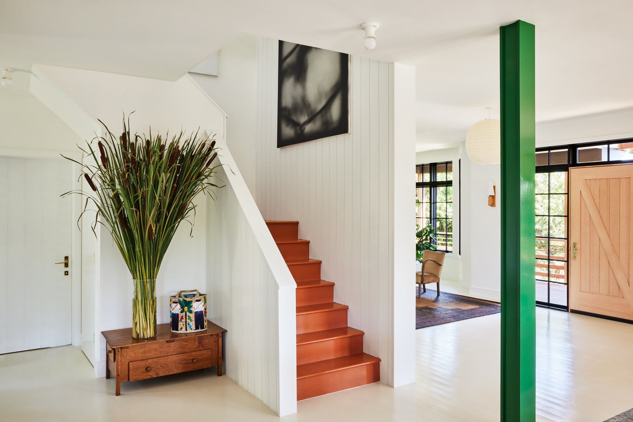

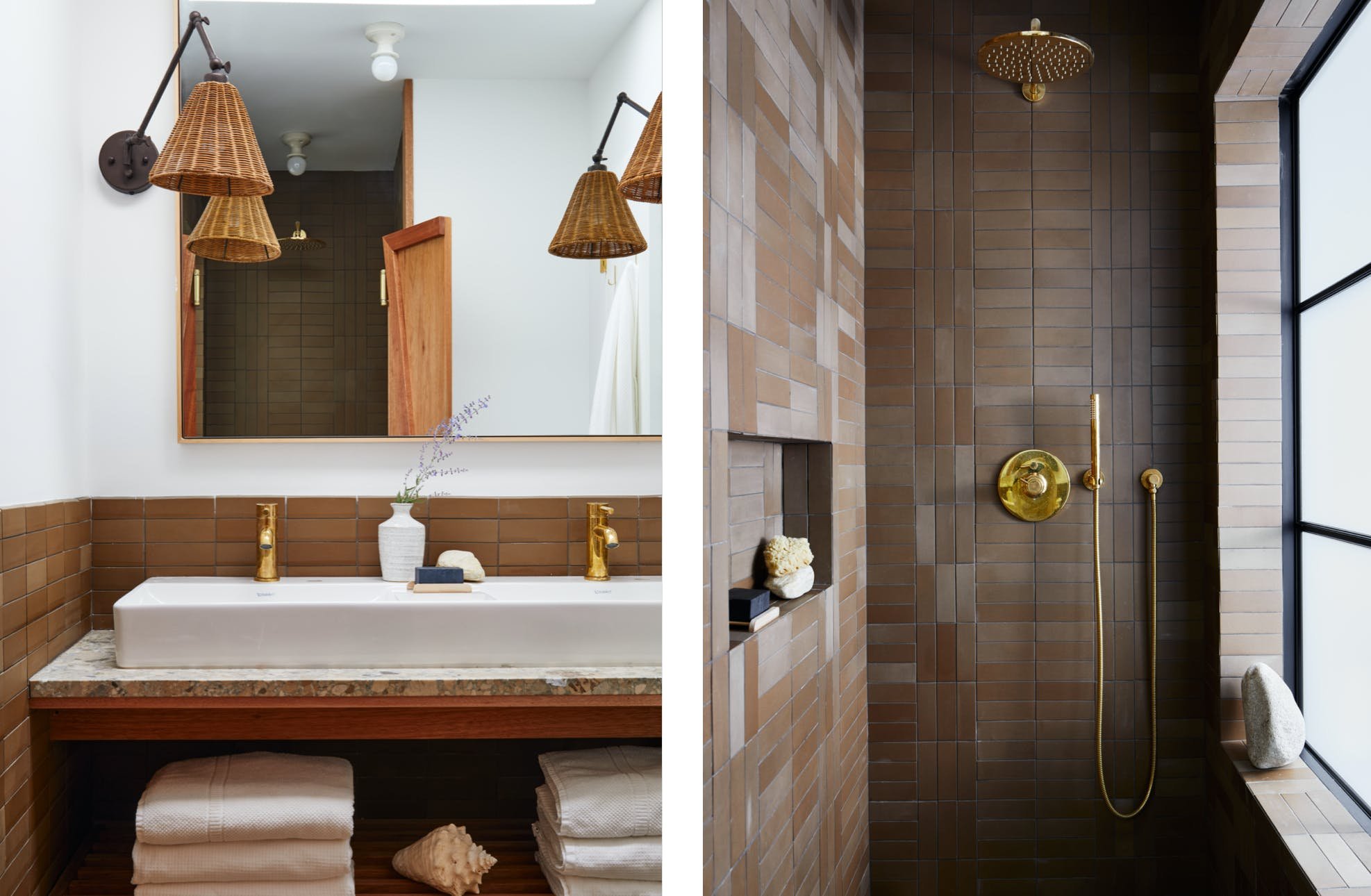
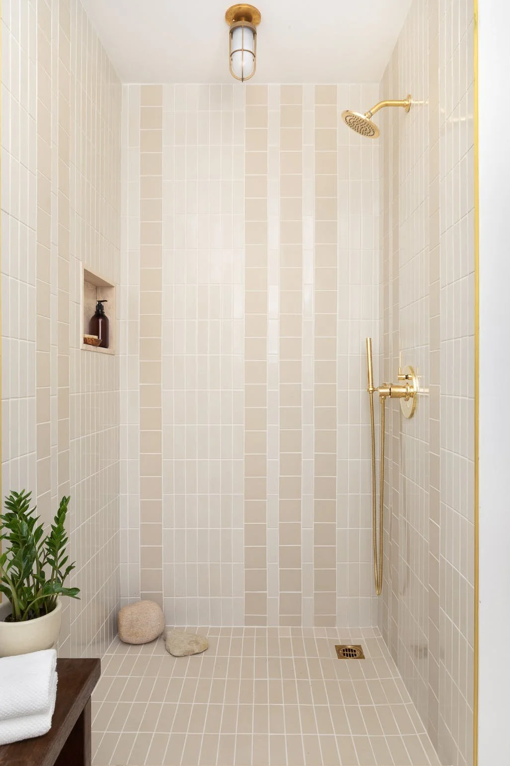

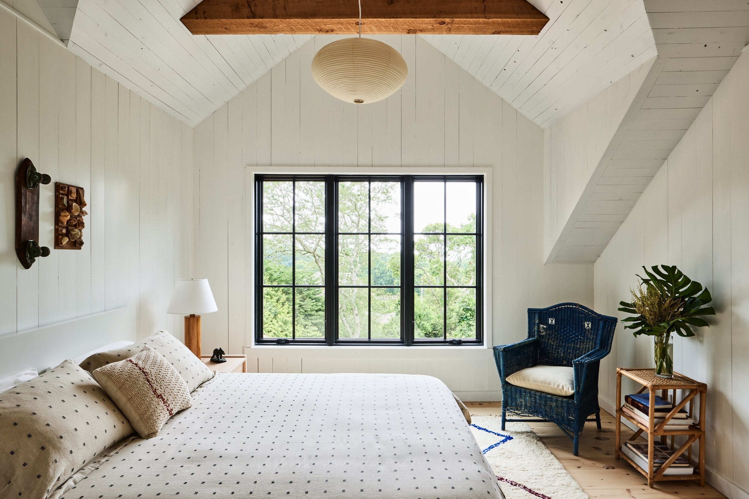
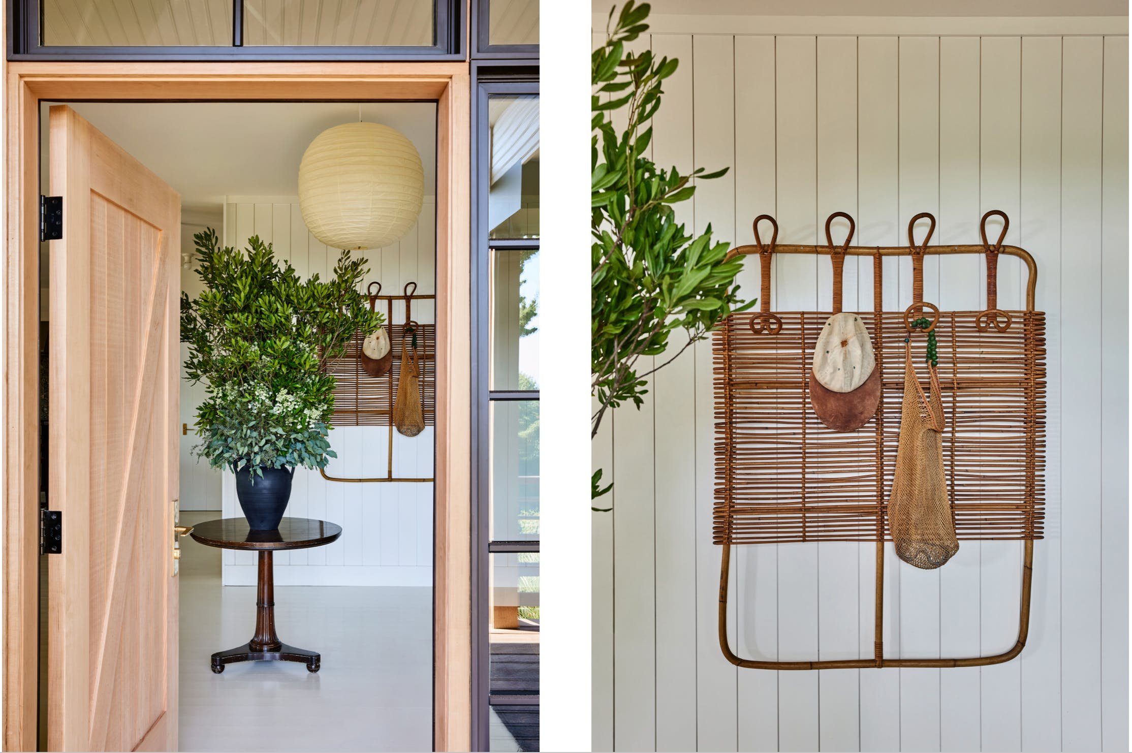

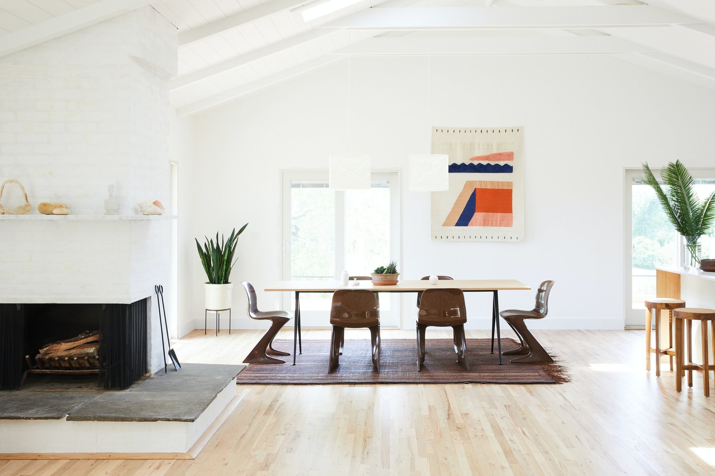
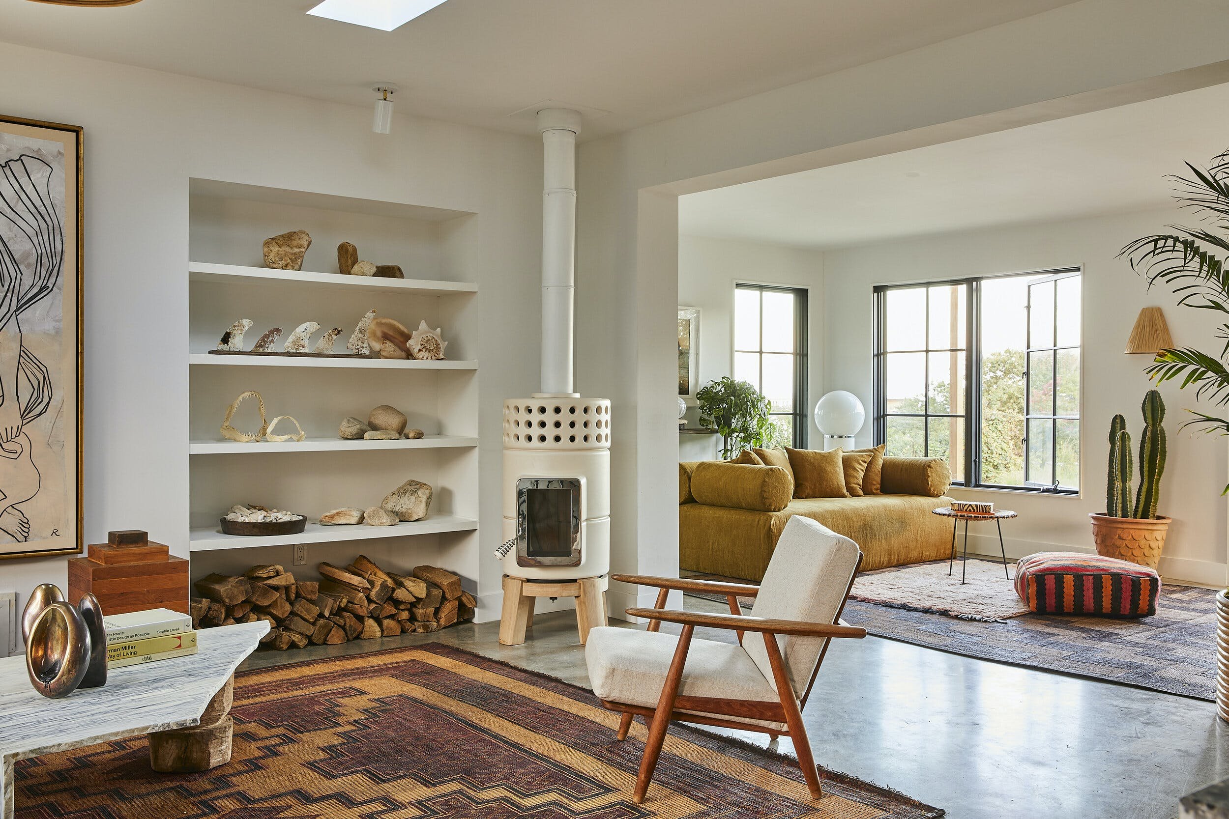

I'm including a lot of photos this week because I want you to see that amazing design doesn't have to mean expensive. If you are willing to take small risks (like that green post, simply executed with vibrant paint), they can have a huge impact!
2) Handpicked: REAL ESTATE
I was looking forward to this listing because it's right on my street... but my neighbor didn't even make it to the Open House Sunday before it was snatched up. I'm posting it here however because sometimes sales fall through (this is how we got OUR first home in San Francisco).
The houses on my street were all built at the same time - late 1800s/early 1900s - and were designed by the same architect. So they all have sweet Victorian details that are a little different from each other - detailed corbels and porches, arches, leaded glass windows and spacious rooms.
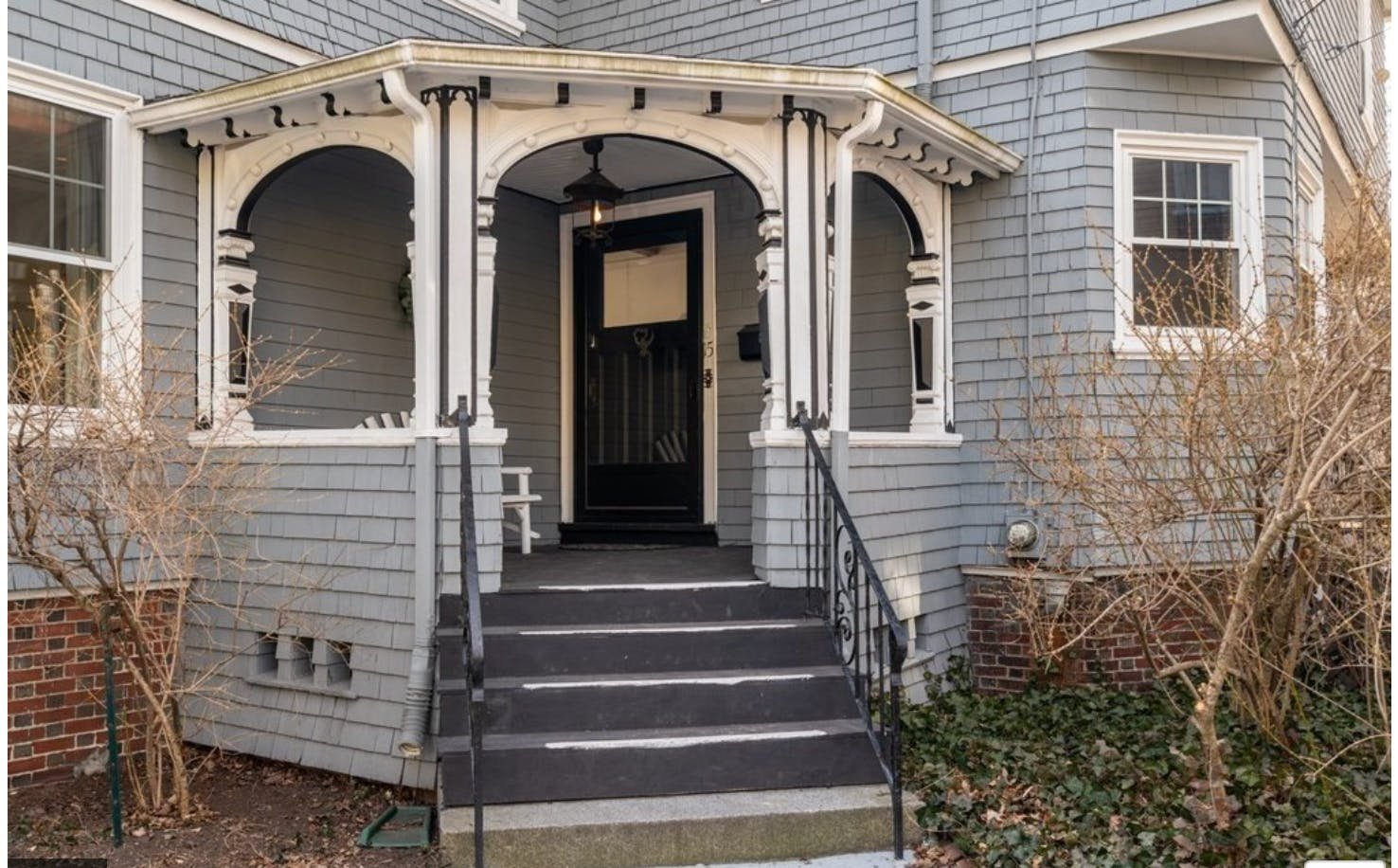
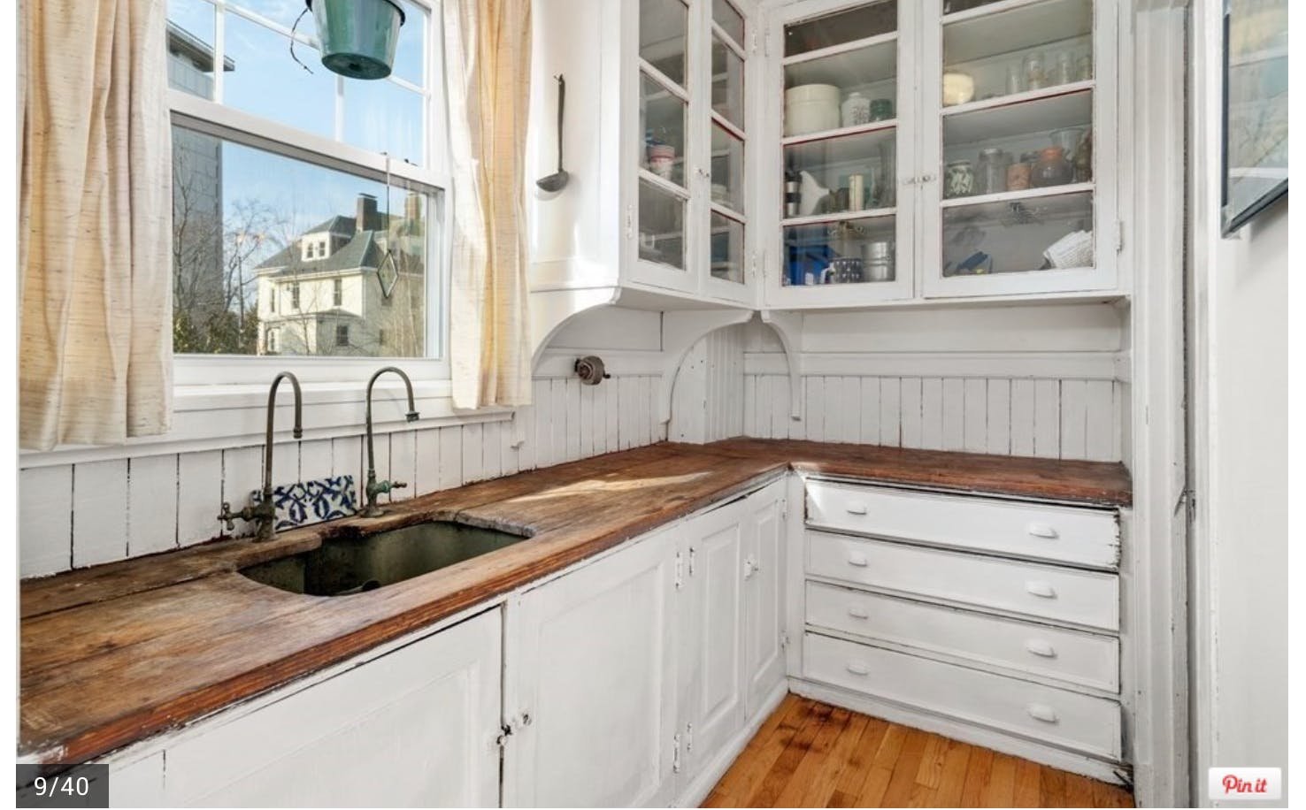
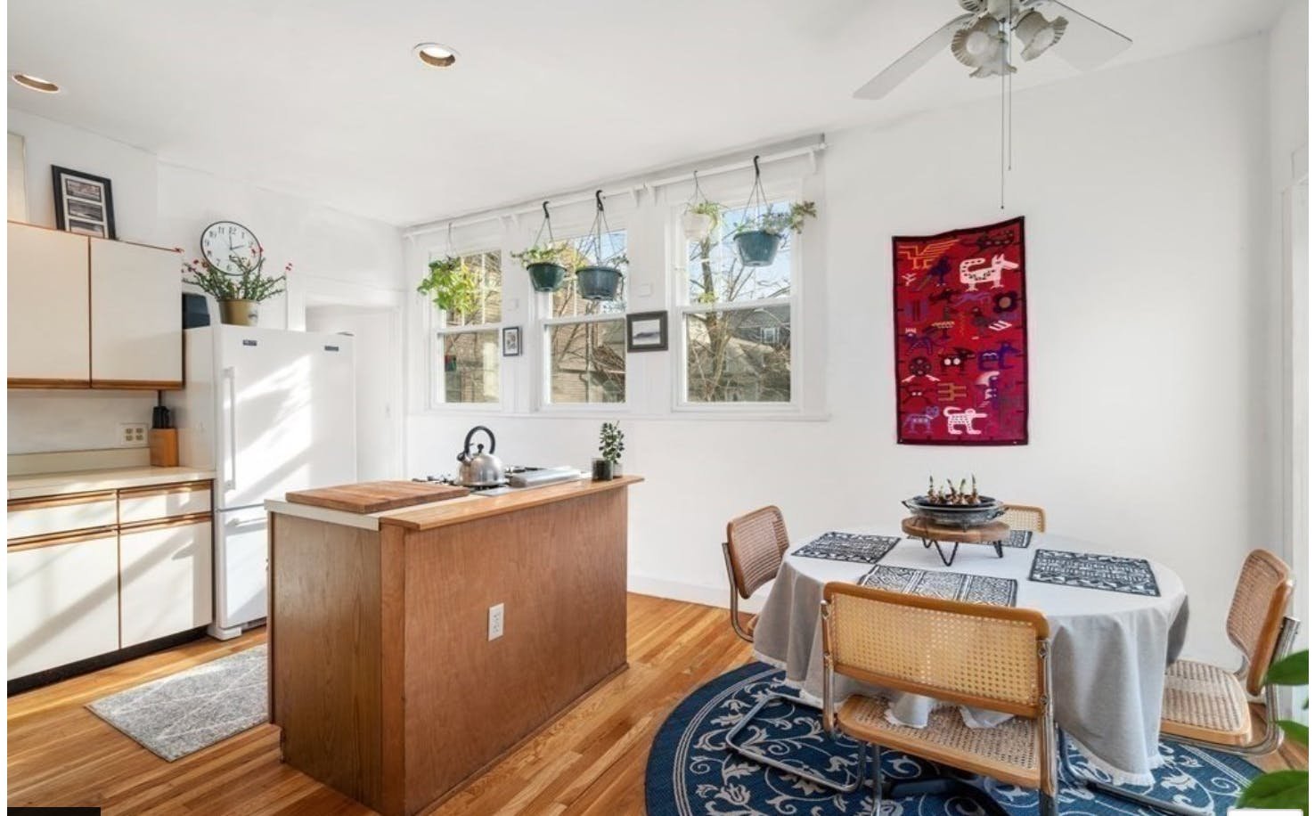
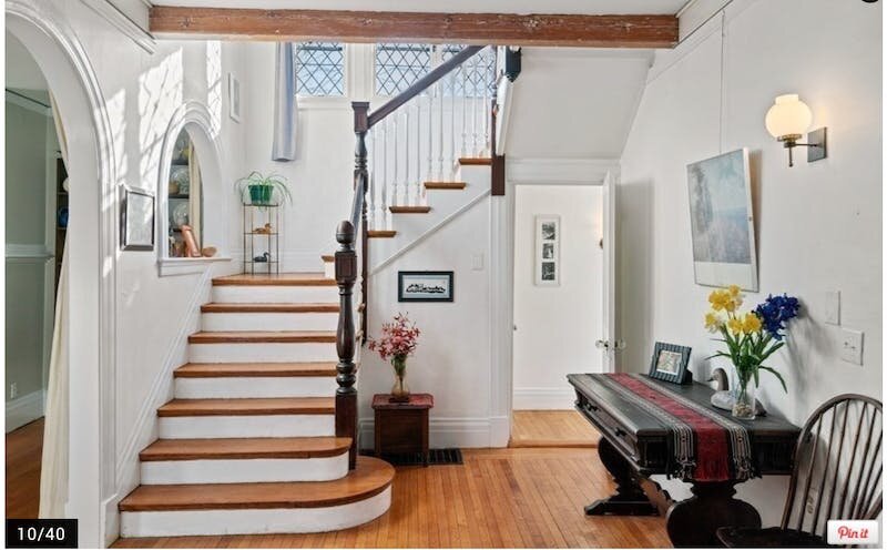
It needs a new kitchen and baths, but the spaces are light-filled and the luxury of a dead-end street in the middle of the city and steps to Harvard cannot be overstated.
3) Handpicked: STYLE
I learned about artist and textile designer Lulie Wallace after seeing her gorgeous fabrics at a favorite house on Harbor Island (in the Bahamas). I love the references to old-fashioned British prints with a contemporary, painterly feel. And of course, I love the color palettes. Mixed with bright white, the prints feel so fresh and beachy, while when mixed with moodier Farrow and Ball paints, you get that layered English look that is so beloved and timeless
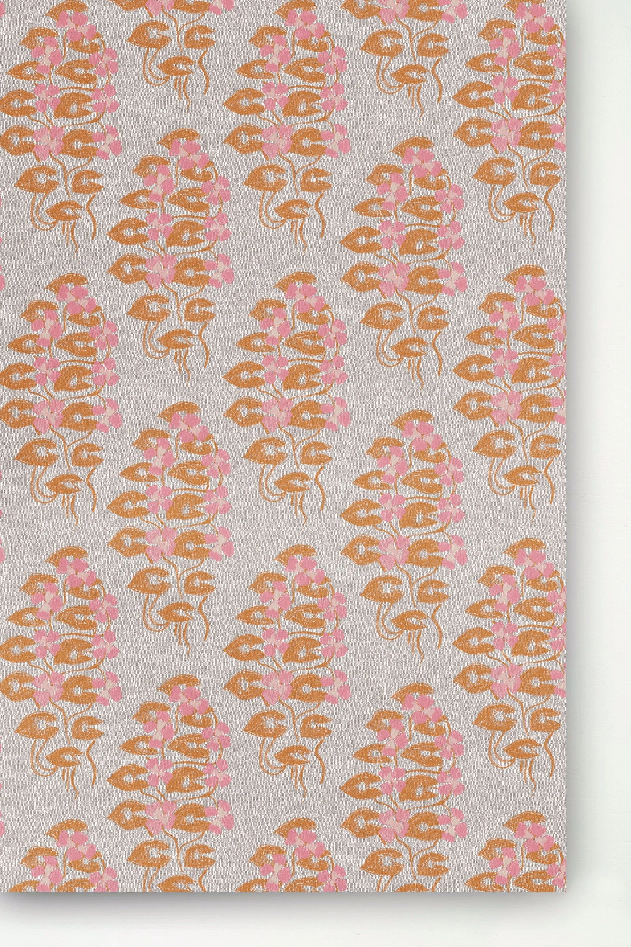
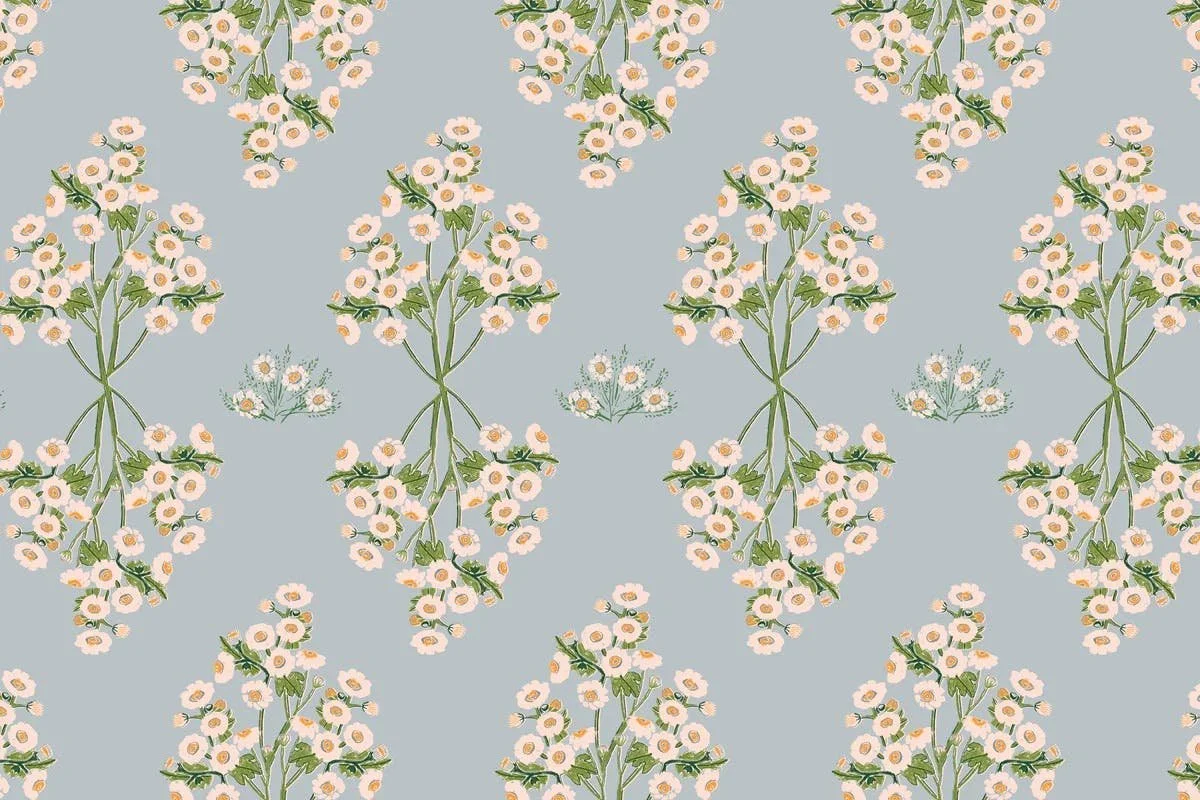
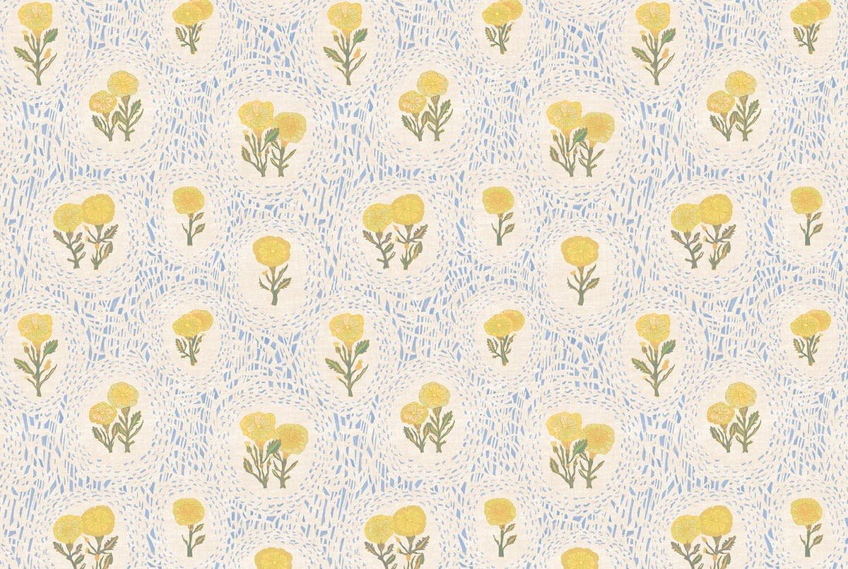
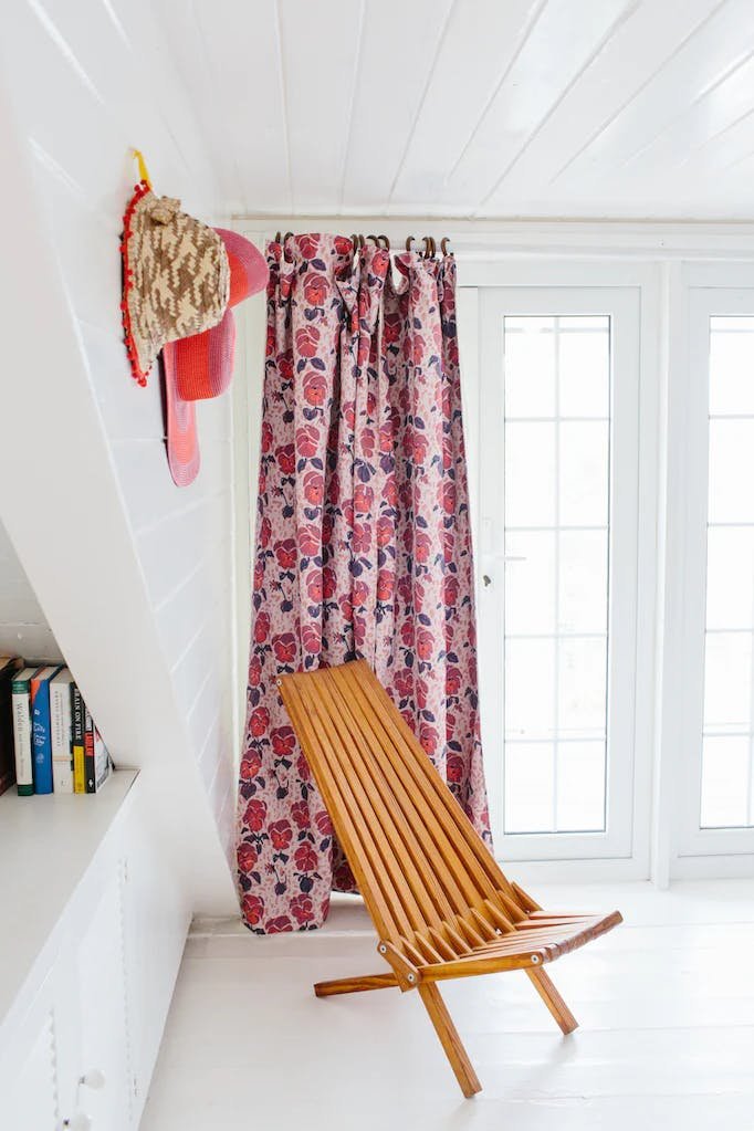
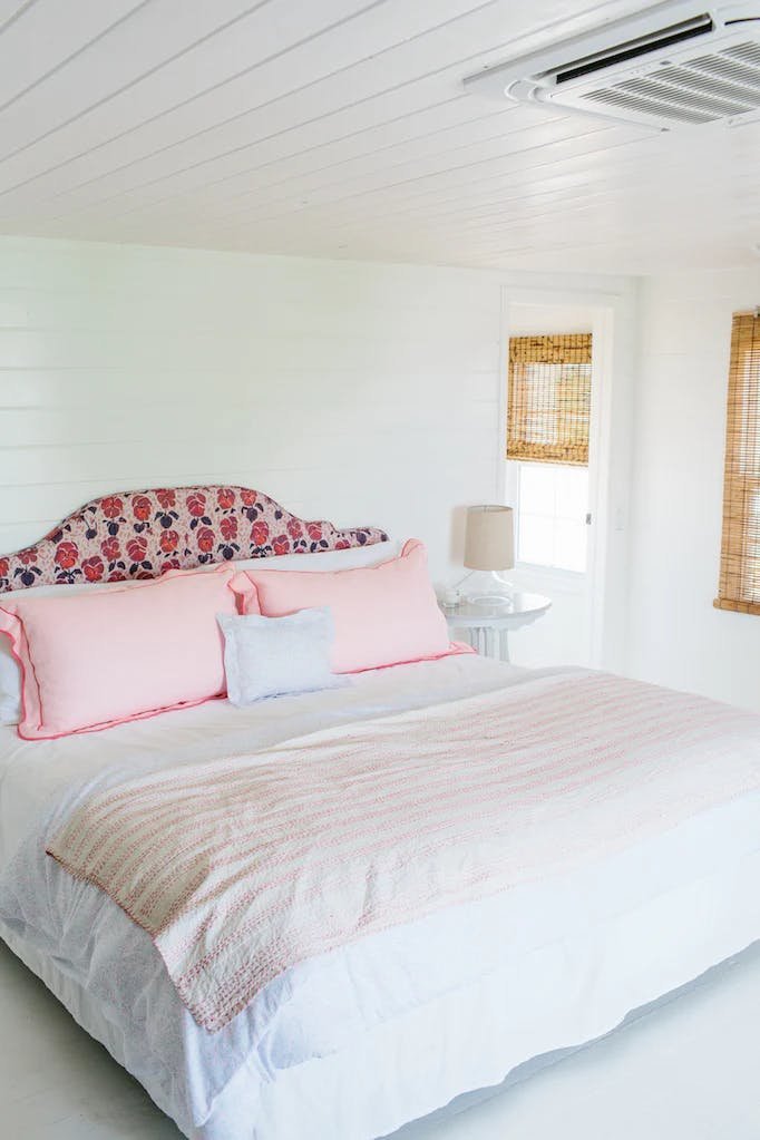
They're a little reminiscent of Sister Parish, but with an updated feel (and of course absolutely tied to Lulie's first love of painting). I am definitely going to be suggesting these gorgeous prints to my Historic Tavern clients!
That's all from our team this week - can't wait until next week!
X Isabella